9. Experimenting with the \(n\) Queens Genetic Algorithm
It is time to tinker with the provided \(n\) queens genetic algorithm implementation
The purpose of this is to
Gain more hands on experience working with a genetic algorithm
Implement different operators and see the impact of the changes
Implement a different representation to see how it impacts results
See how to start comparing results
9.1. Run Multiple Times and Plot
Note
The easiest way to get the code up and running is to fork the github repository, download it, and run the setup described in the “README”.
Alternatively, the scripts can be downloaded individually to /src, but this may require some additional setup for
the dependencies. It is recommended to make a virtual environment
and download any required dependencies with pip.
Get the \(n\) queens genetic algorithm running
Play around with the hyperparameters
Try to make the problem more difficult by increasing the value of \(n\)
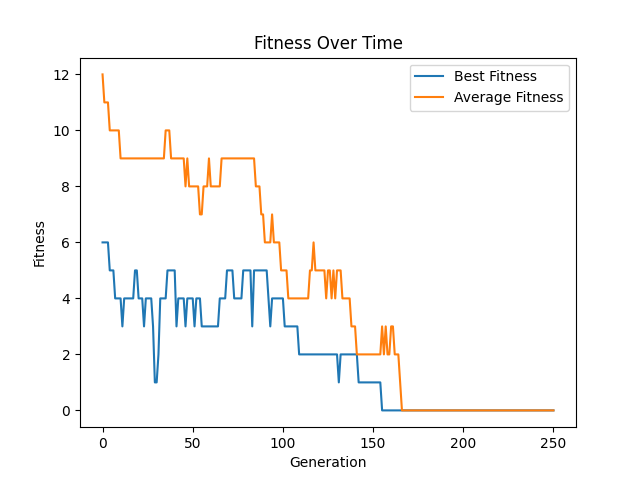
Create a learning curve plot
See the bitstring genetic algorithm for an example of how this was done

Learning curve for some run of the \(n\) queens genetic algorithm. This plot is for a run where \(n=20\), the population size was 100, the number of generations was 250, and a tournament size of 2. Since this is a minimization problem, lower fitness values are better.
9.1.1. Creating a Distribution
Since genetic algorithms are stochastic processes, one should expect variability between runs
Every time the algorithm is run, different results will likely be obtained
This is to be expected given the amount of randomness involved
Initial population is created randomly
Selection is done randomly
Genetic operators are applied randomly
Genetic operators apply operations on random parts of the chromosomes
This means it is not possible to run the algorithm once to truly measure its effectiveness
Learning curves are really only good for a quick eyeball test of the evolutionary learning process
Instead, a distribution of results should be created along with summary statistics
Run the algorithm a total of \(100\) times and save the best fitness result of each run
This will create a list of 100 fitness values
Calculate some simple summary statistics of the \(100\) runs’ results
Mean and/or median
Standard deviation and/or interquartile range
Anything else that could be interesting
Plot the fitness values in a histogram to see the distribution of results

Distribution of the results of 100 runs of the \(n\) queens genetic algorithm where \(n=20\), population size was 100, generations was 250, and a tournament size of 2.
To make the problem harder, repeat these questions for \(n=30\)
When happy with the results, save them somewhere to be used later for comparisons
9.2. Change Operators
For the following, try to be as creative as possible and feel free to try multiple ideas
It’s always good to explore and tinker
It really does not matter how good or bad the results are in the end
If stuck, look up existing popular ideas for the operators to implement
Additionally, test each change in isolation to simplify the analysis of the impact of the change
In other words, revert the previous changes before moving on to the next task
Finally, run each \(100\) times and generate the summary statistics and distributions
Be sure to save the results somewhere for later comparisons
Change out the crossover operator for something else and run the experiments again
Change out the mutation operator for something else and run the experiments again
Change out the selection operator for something else and run the experiments again
9.3. Change Representation
Change the representation from the permutation representation
Use either the 2D or 1D list representations previously discussed
This will require a change of the fitness function and genetic operators
Expect this change to negatively impact the quality of the results the genetic algorithm obtains
Run the algorithm \(100\) times and generate summary statistics and the distribution of results
Save the results somewhere for later comparisons
9.4. Comparing Results
The summary statistics of a distribution of results is a great way for a quick perspective of the results
Often, people will compare the summary statistics of two distributions to make a conclusion of what is better
If the results when using crossover X has a better mean than the results of crossover Y, then X is better, right?
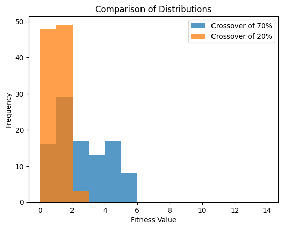
For example, from the data plotted in the below figure
The mean of the genetic algorithm with a crossover rate of 70% was \(2.1\)
The mean of the genetic algorithm with a crossover rate of 20% was \(0.55\)
It would seem that the crossover rate of 20% provided better results
But in reality, this is a poor way to perform a comparison
This is because, the goal is to compare the distribution of the results, not the summary statistics
The simplest way to do this is to plot the distributions against each other and perform an eyeball test

Comparison of two distribution of results of \(100\) runs. These results were obtained by running the genetic algorithm as provided where \(n=20\), population size was 100, generations was 250, and a tournament size of 2. One run had a crossover rate of 70% and the other had a rate of 20%. It is clear, from this comparison, that using a crossover rate of 20% is superior.
9.4.1. Probability Value
Unfortunately, an eyeball test provides no quantitative data so it’s difficult to truly compare results
Instead, a mechanism for measuring the results of comparing distributions is used
The measurement provides a value called a probability value (p-value)
It provides the probability that two distributions were created by sampling the same thing
Simply, a big p-value means that it is likely that the two distributions are not too different
A small p-value means that it is likely that the two distributions are quite different
Ideally, the best way to do the comparison is with something called a permutation/randomization test
This test is an intuitive way to compare distributions
It provides a way to measure the difference between any statistic
This idea will discussed in more detail in a later topic to get a sense of what it means
Unfortunately, a permutation/randomization test, although simple to do, is more work than other popular alternatives
Instead, it is common to see a t-test or a Mann-Whitney U test
A t-test requires assumptions that are often not true when comparing genetic algorithm results
As a result, Mann-Whitney U tests are more “powerful”
However, a t-test will often be sufficient
When comparing the distributions shown above
The p-value obtained by an independent t-test was \(2.88 \times 10^{-17}\)
The p-value obtained by a Mann-Whitney U test was \(2.97 \times 10^{-14}\)
Although the p-values differ, they are both very small
Thus, one could conclude that there is a very small probability that these distributions are from the same thing
In other words, given the lower mean of the 20% crossover rate and the low p-value
The results of using a crossover rate of 20% is almost certainly better
9.4.2. Effect Size
Finally, just because there is in fact a difference in the distributions, it doesn’t really mean one should care
It only says if the distributions are different
It does not detail the strength or magnitude of the effect
This is where effect size comes in
Simply, the distributions are different, but does anyone care?
The crudest way to think of this is to go back and compare the means
How different are the means?
Sure, the distributions are in fact different, but is the difference in the means tiny?
This is commonly calculated with the standardized difference/Cohen’s d between two means
\(\frac{\overline{x_1} - \overline{x_2}}{\sigma}\)
Divide the difference between the group means by the standard deviation of the aggregate of both groups
The standard difference when comparing the above distributions is \(1.10\)
The bigger the number, the bigger the effect size
Thus, the bigger, the more one would care
9.4.3. Perform the Comparisons
Comparing each of the groups of \(100\) results is going to be difficult
Combinatorial explosion
Therefore, for the following tasks, only select two or three groups of \(100\) to compare
Select those that seem the most interesting
These are not necessary the best performing results
Based on the above, tabulate simple summary statistics for each distribution
Plot the distributions against one another like in the above figure
Perform a t-test or Mann-Whitney U test to obtain a p-value
Calculate the effect size with the standardized difference/Cohen’s d
What are the conclusions one can make from these results?
Be critical and try to come up with the most meaningful conclusions
Try to reason about why the results are what they are
9.5. For Next Class
TBD